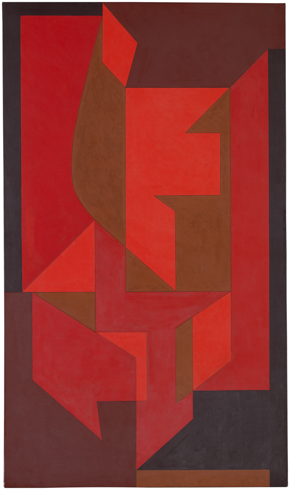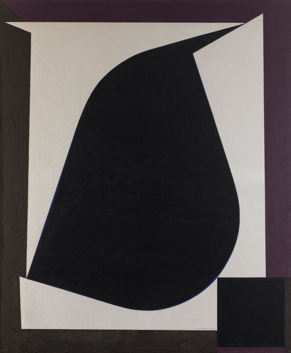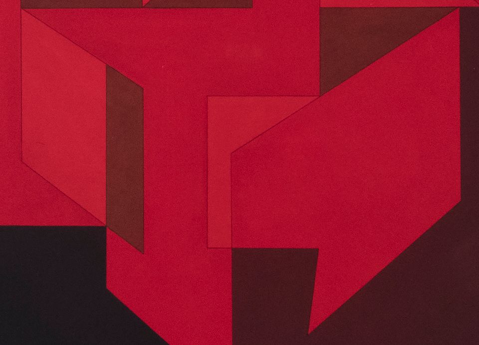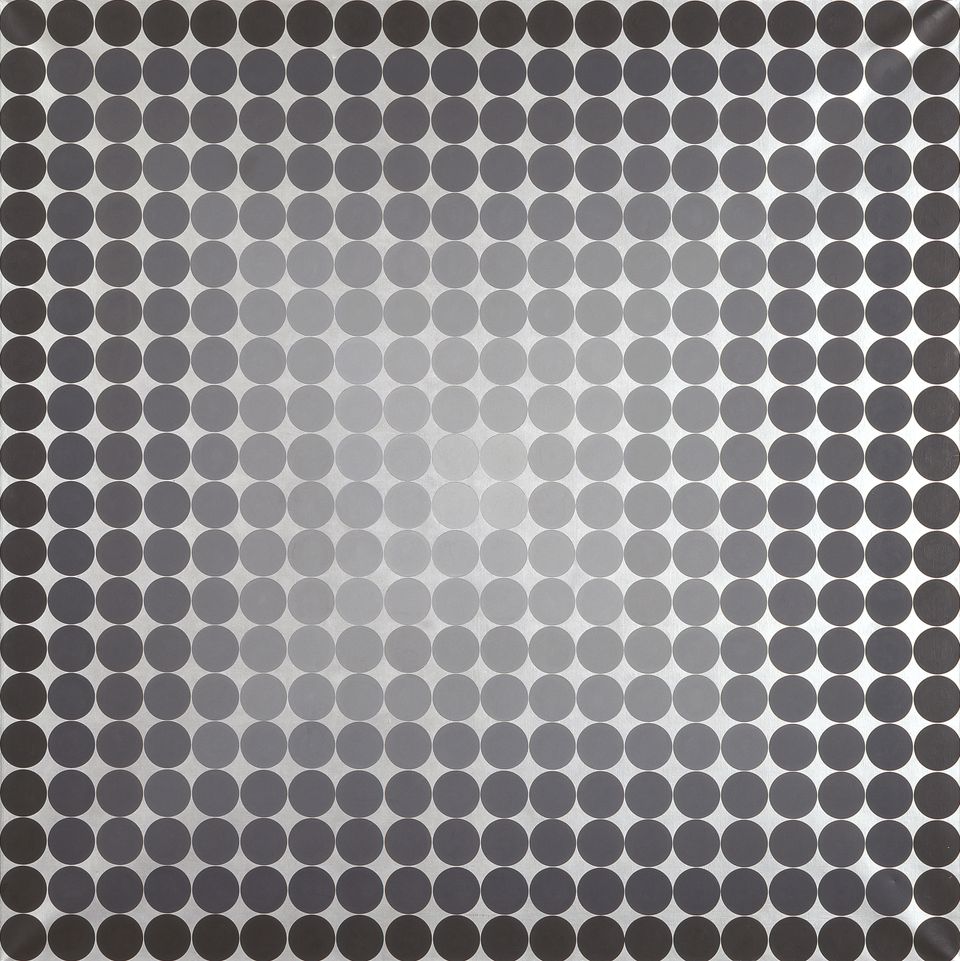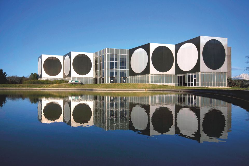
Hypnotic motifs, pulsating forms and flickering patterns: the master of optical illusion put vision to the test.
Victor Vasarely’s variegated oeuvre is today more up to date than ever. Availing itself of the visual effects generated by computers of the present, it anticipated the aesthetic of computer games. Yet the vivid colours of Vasarely’s rigorously geometric patterns are elements of artistic design – as are the strong contrasts of his black-and-white painting.
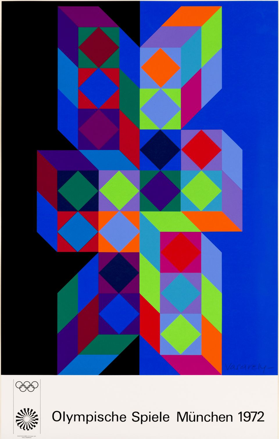
Thanks to reproduction techniques and the application of his ideas in everyday life, his art ultimately gained presence throughout our visual world. And to this day, it plays its part in shaping our conscious. By 1972, Victor Vasarely had reached the height of his creative powers. He received ever more commissions to design architecture and interiors.
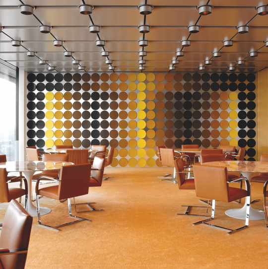

Spatial installation, Deutsche Bundesbank, Frankfurt am Main. Photo: Wolfgang Günzel, © 2018 VG Bild-Kunst, Bonn
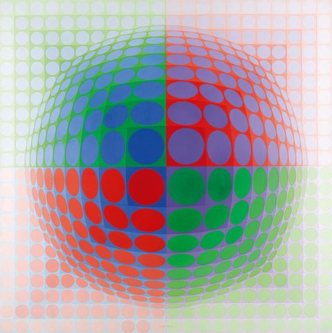
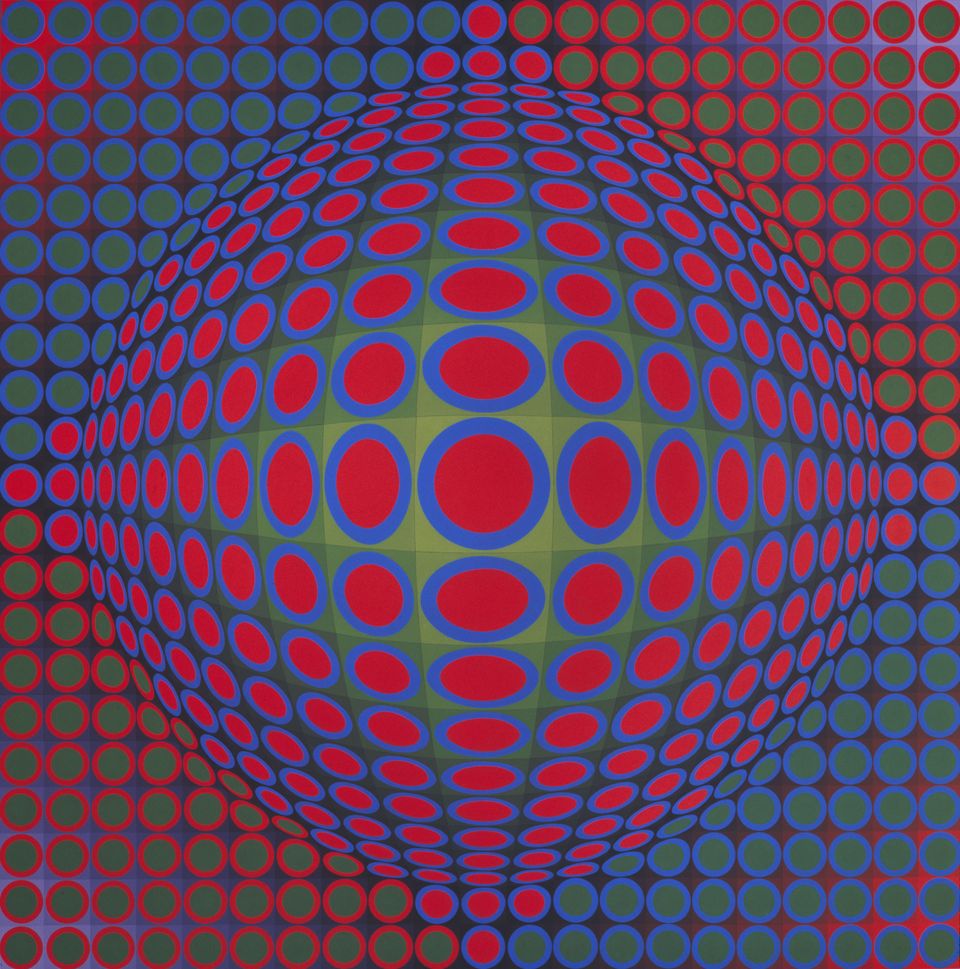
Victor Vasarely, Vega Pal,1969Acryl auf Leinwand, 200 × 200 cm, Musée Unterlinden, Colmar, © 2018 VG Bild-Kunst, Bonn
Highly expressive interior decoration, or space-consuming work of Op Art? Victor Vasarely blurred the boundaries between free and applied art. His concepts draw on medical and mathematical findings about perception. He explored them comprehensively in his art: his wall and ceiling structures seem to make the room vibrate as the viewer traverses it. A Hungarian-born Frenchman, the founder of Op Art is one of the great artists of the twentieth century. Vasarely moved between the various styles of the interbellum period and post-war modernism. His artistic roots lay in his explorations of early modern art. He took inspiration and orientation from theories of the Bauhaus, Suprematism and geometric abstraction.
His colourful images – as technical as they are psychedelic in appearance – would one day push their way into three-dimensional space by means of optical effects. In the process, they bewilder the senses and deceive perception. The artist’s structures consist of fundamental geometric forms and use the loud colours of Pop Art. His imagery stands for a society heading confidently towards a future it believes in. It contributed to shaping the iridescent face of 1960s and ’70s modernism and was as much a part of the artistic avant-garde as of popular culture.
Vasarely’s
roots
The unity of art, life and craftsmanship – that was the basic idea of the Weimar Bauhaus. It would also become Victor Vasarely’s guiding principle.


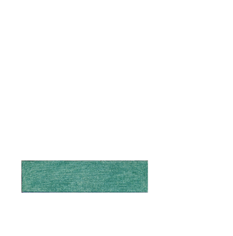
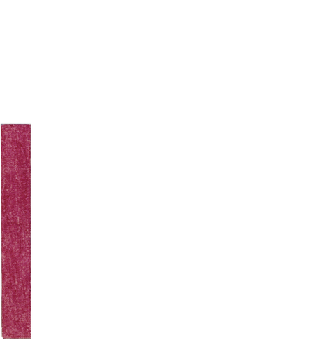
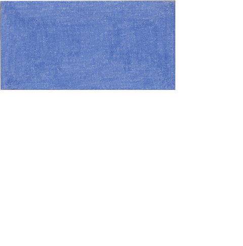
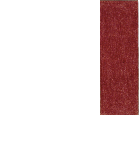
Mixed technique on paper, 23 × 23 cm each, Michele Vasarely Foundation. ADAGP / Vasarely Estate, Foto: Michele Vasarely Foundation, © 2018 VG Bild-Kunst, Bonn
By the time he was twenty-three, the Hungarian Victor Vasarely already had a degree in business communication to show for himself and had embarked on the study of economy and advertising. He worked as a bookkeeper and graphic artist in a medical laboratory in Budapest and attended lectures at the medical school. During a two-year training course at a private art academy he learned precision draughtsmanship. On the side, he earned a living with graphic design for advertising purposes.
In 1929, Vasarely enrolled at the Műhely (Hungarian for “workshop”, “studio”) in Budapest, where he learned about the latest tendencies in international art. Sándor Bortnyik had founded this private school for commercial design after the model of the Weimar Bauhaus. It was during a stay of several years in Weimar that Bortnyik had acquainted himself with the Bauhaus activities. He had been well-connected in the Eastern German town and kept company with the circle around De-Stijl co-founder Theo van Doesburg. At the Műhely, Bortnyik passed his insights on to his pupils.
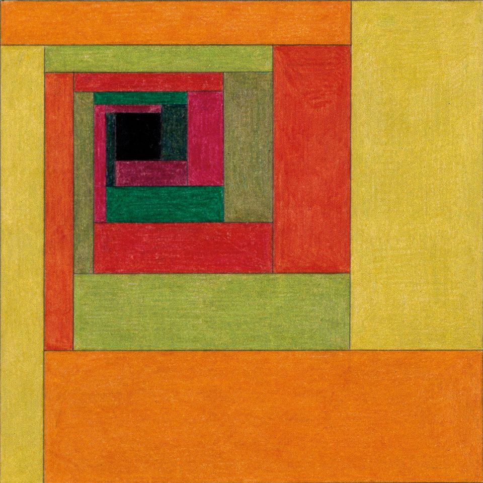
Mixed technique on paper, 23 × 23 cm each, Michele Vasarely Foundation. ADAGP / Vasarely Estate, Photo: Michele Vasarely Foundation, © 2018 VG Bild-Kunst, Bonn
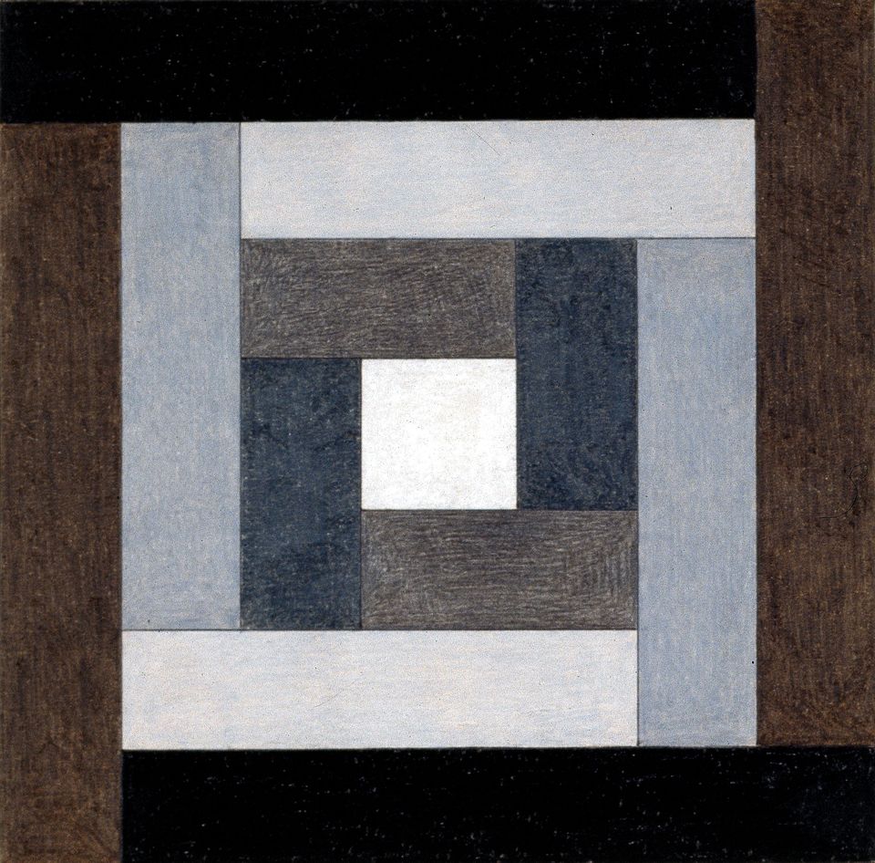
Mixed technique on paper, 23 × 23 cm each, Michele Vasarely Foundation. ADAGP / Vasarely Estate, Photo: Michele Vasarely Foundation, © 2018 VG Bild-Kunst, Bonn
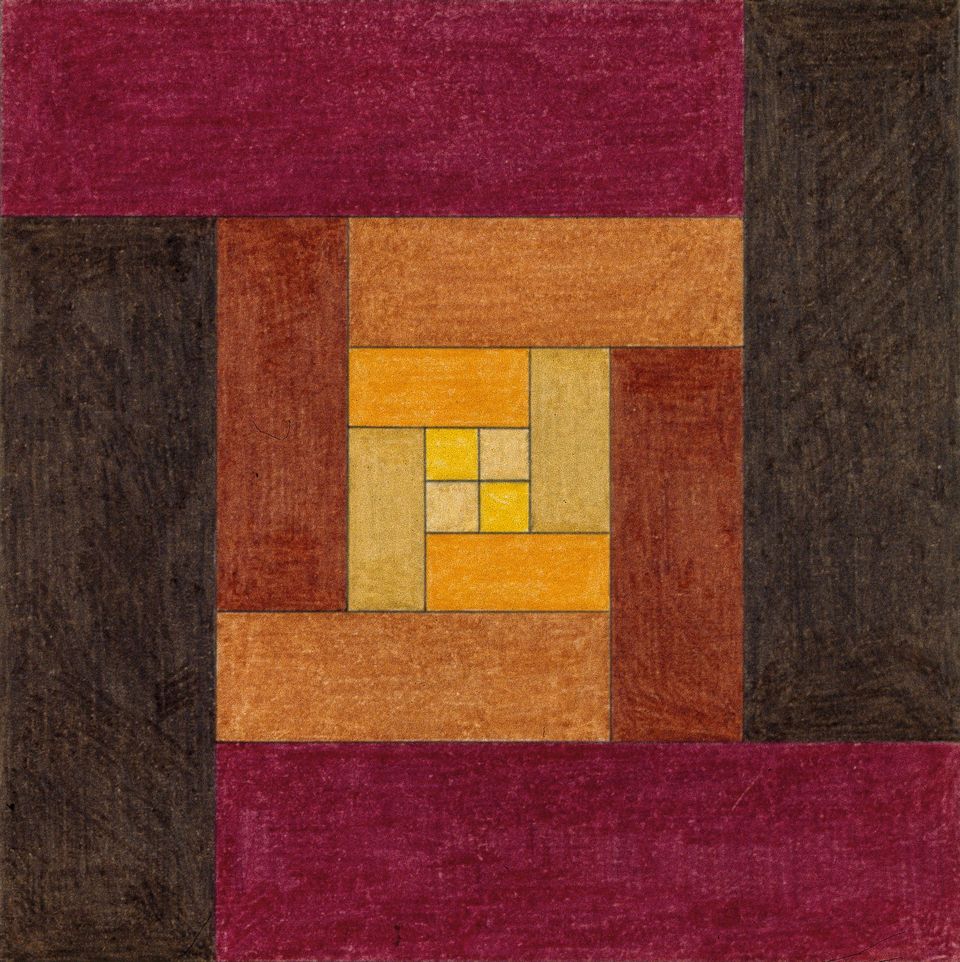
Mixed technique on paper, 23 × 23 cm each, Michele Vasarely Foundation. ADAGP/ Vasarely Estate, Photo: Michele Vasarely Foundation, © 2018 VG Bild-Kunst, Bonn
Reform, a new departure, a vision of society: the instruction at the Műhely revolved around art’s influence on everyday life. Social utopias were also of key importance for the concepts underlying the Bauhaus and De Stijl. Living environments were to be designed in such a way as to benefit their inhabitants.
Simple forms and clear colours characterized the style that developed. Study after study was undertaken to investigate their interaction and impact.
Victor Vasarely internalized the ideas of the Bauhaus and his urge for change grew. In response to the political situation in his native Hungary, he emigrated to Paris in 1930. There he worked as a graphic designer in advertising and was extremely successful.
Experiment on paper
Commercial designer by day, artist by night. Vasarely dealt with various aesthetic issues on the job, and also pursued them in painting.
His day-to-day work involved finding optical effects that would have an impact on the viewer. He learned how perception reacts to patterns and structures that deform and change, and what effect strong light-dark contrasts have on the beholder. Fascinated by form and colour, line and surface, he explored their interrelationships in his paintings as well.
“During this period, I subjected all the problems of plasticity that occurred to me – composition, colour, light and shade, matter, two and three-dimensionality – to close investigation.”
Jean-Louis Ferrier, Gespräche mit Victor Vasarely Spiegelschrift 8, Köln 1971, p. 23.
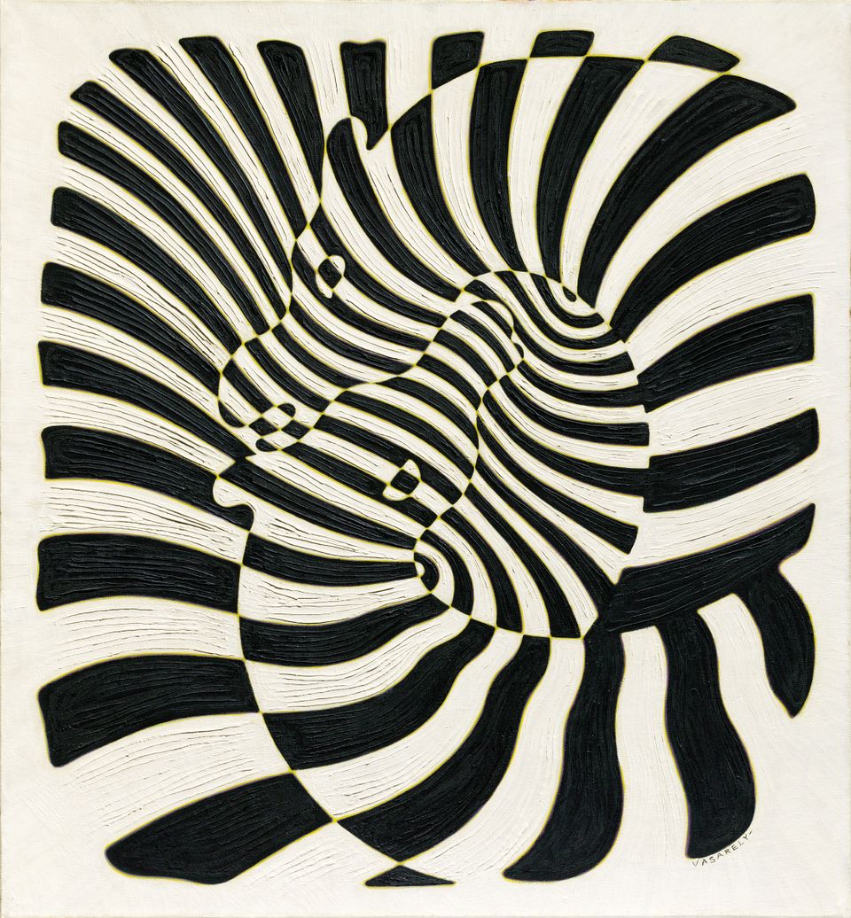
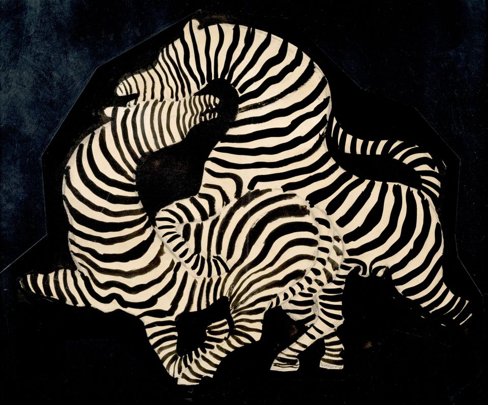
Striking patterns and strong contrasts sparked Vasarely’s interest. Zebra skin was accordingly a recurring theme in his work over the years. It was the perfect field for his artistic experiments.
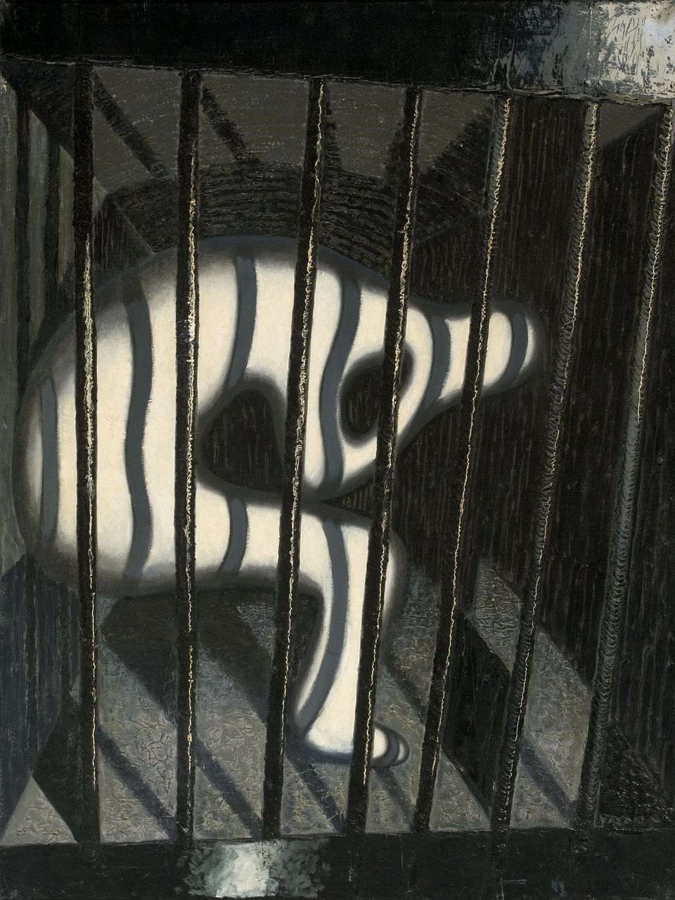
Oil on canvas, 130 × 97 cm, Private collection © 2018 VG Bild-Kunst, Bonn
A prisoner is pictured sitting behind the bars of his cell. Like his contemporaries, the Cubists, Futurists and Surrealists, Vasarely experimented with figural depiction. Yet the painting’s structures and patterns are far more conspicuous than the actual pictorial motif. The texture created by the dark bars and the shadows they cast on the white body takes on a life of its own.
A self-portrait of the artist, shattered to pieces. Here we find several Vasarelys gazing at us, as if through the shards of a broken mirror. Deconstruction and movement were aspects the Futurists devoted themselves to. From his exploration of the styles prevalent in early modern art, Vasarely developed his own optical vocabulary.
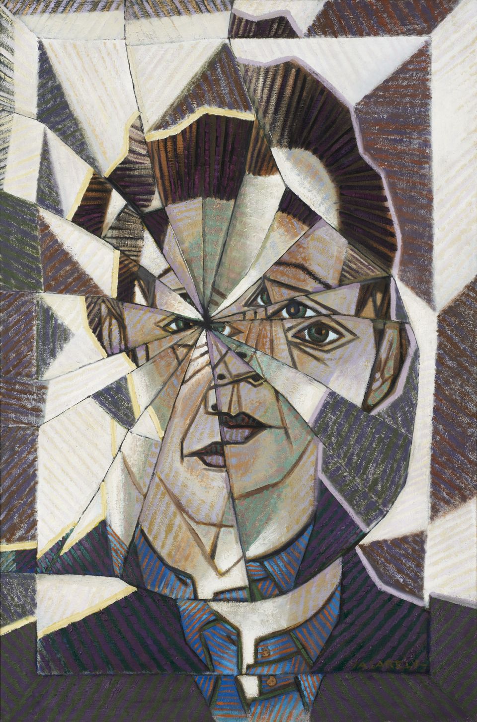
Oil on canvas, 116 × 89 cm, Gallery Philippe David, Zurich © 2018 VG Bild-Kunst, Bonn
The moving eye
It’s easy to depict movement in a video. But how can an artist represent it in a static painting?
To find ways of depicting vibrations, rotations and oscillations on canvas – that was the most important challenge Victor Vasarely faced. Already as a commercial designer he began constructing them with the aid of lines, surfaces and volumes.
The eye glides rhythmically from one wave to the next. The rings curve themselves around the centre at regular intervals. Likewise in a regular pattern, they grow now wider, now narrower. An impression of movement is created. This phenomenon is undoubtedly what appealed to Vasarely most about the depiction. He nevertheless gave it a kind of narrative content by adding drops of water and a whale.
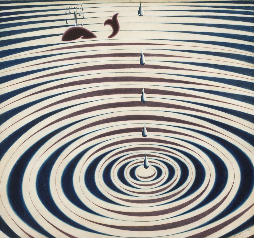
Ink, gouache on paper on wood, 63 × 58 cm, Private collection © 2018 VG Bild-Kunst, Bonn
Real observation
abstract effect
Vasarely’s experiences and observations of his surroundings turned his conceptions of art topsy-turvy. He abandoned representational painting.
Abstract painting works with the simplification or re-forming of real objects. Vasarely took this process a step further, conceptually speaking: ever more frequently, perception and the visual process themselves were the themes of his painting.
Special experiences provided the impulse for these three work series, which simultaneously paved Vasarely’s road to abstraction – though in very different ways. Elements from his art of these years would reappear again and again in his later works.
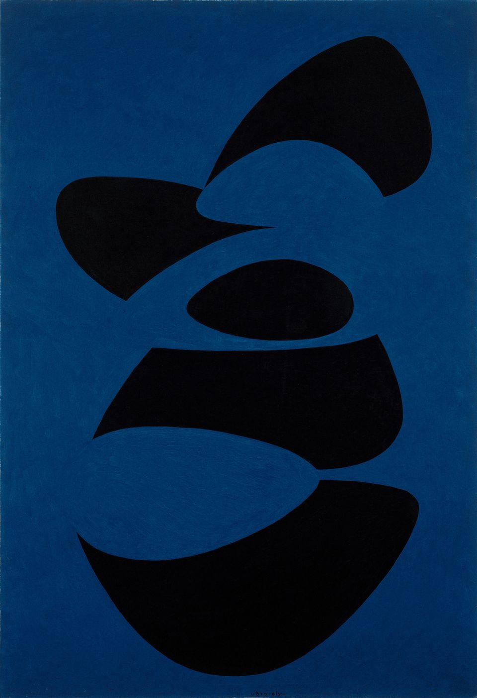
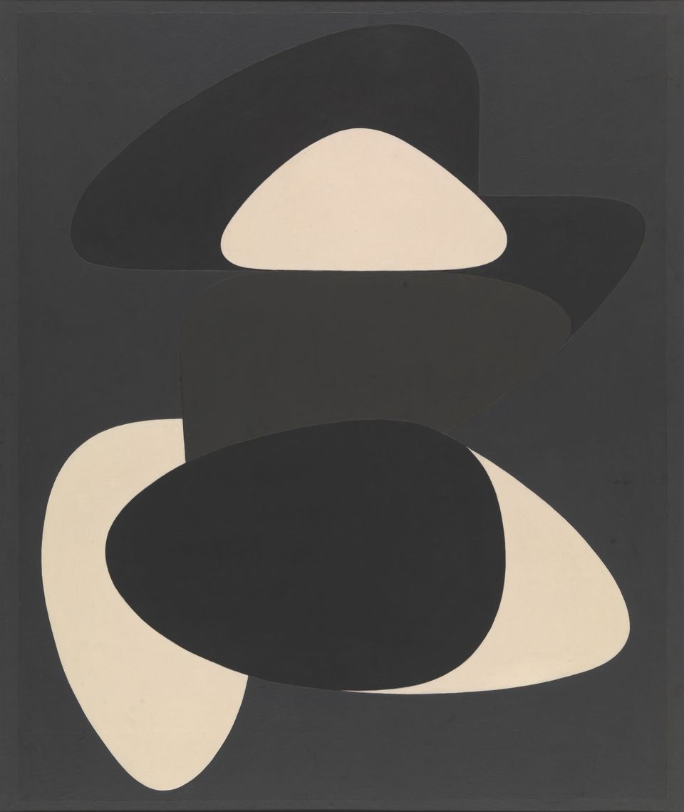
Stones and ellipses
What happens in the visual process when forms are incomplete or overlap one another? Vasarely began investigating such matters in the coastal town of Belle Isle.
“I observed the forms Belle Isle offered me, all of which could be traced back to ellipses and ovals. And in the process, I discovered very intimate relationships between things that were obviously very different. In the morning, the clouds took on the form of pebbles, and just a few metres from the beach, where the sea was already deep, the breakers hitting the rocks looked like huge shells. Even the setting sun was misshapen and became elliptical.”
Jean-Louis Ferrier, Gespräche mit Victor Vasarely. Spiegelschrift 8, Köln 1971, p. 15-16.
Shells and waves, sun and rocky coast: In the summer of 1947, Victor Vasarely spent several weeks in the town of Belle-Île-en-Mer on the coast of Brittany. Sketch-pad in hand, he made drawings of what he saw on his wanderings and collected pebbles, shells and shards. Over time, the force of the waves had rounded their forms.
This natural geometry fascinated the artist. He encountered it both in every grain of sand and in the expanses of the universe. Yet how could he record the pure forms without distorting them? Vasarely embedded the objects, exactly as he had found them, in liquid plaster.
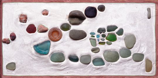
Glass and stones on plaster, 53 × 45 cm, Michele Vasarely Foundation. ADAGP / Vasarely Estate, Photo: Michele Vasarely Foundation, © 2018 VG Bild-Kunst, Bonn
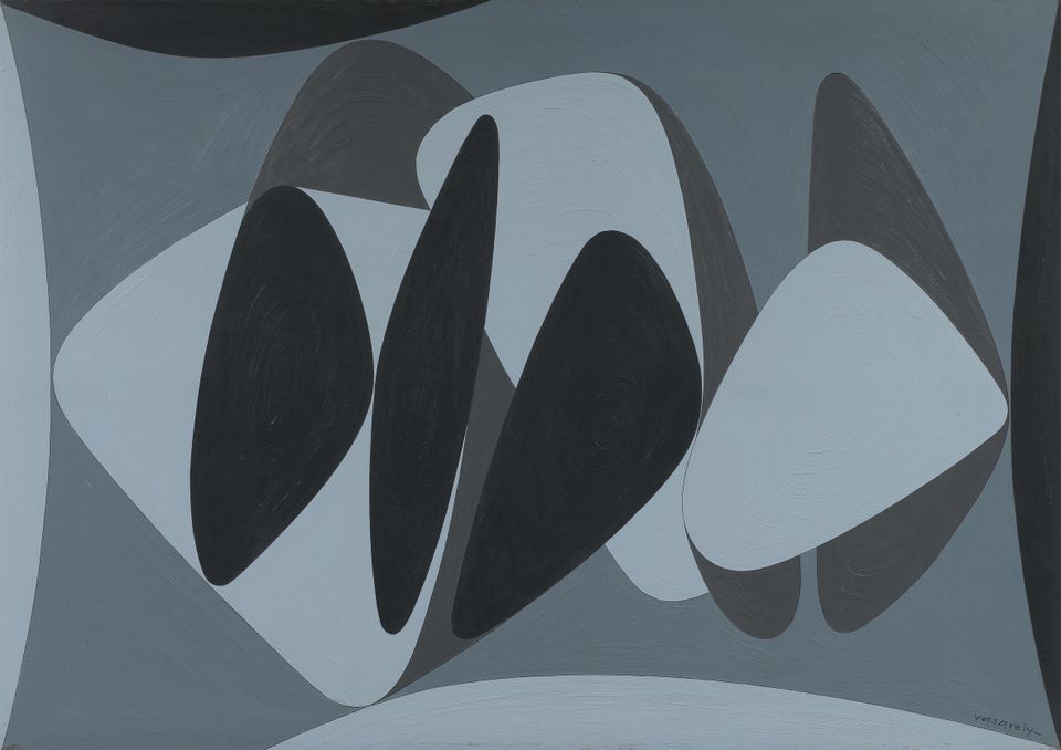
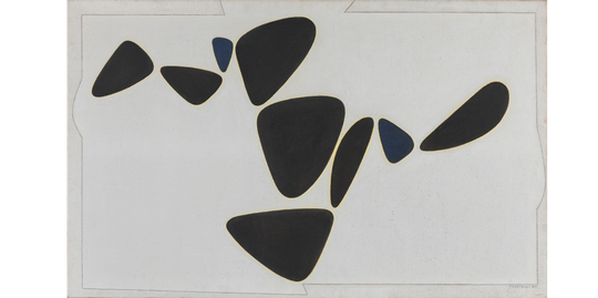
Victor Vasarely, Goulphar, 1947Oil on canvas, 81 × 130 cm, Private collection. Photo: Vincent Everarts Photography Brussels, © 2018 VG Bild-Kunst, Bonn
Vasarely ultimately applied his experiment with natural objects to painting. In the process, his focus shifted more and more to the arrangement of the individual forms and the play of colours. Over the course of several years, he repeatedly studied the effects of various combinations. In some cases the forms overlap or are incomplete. This poses a challenge to visual perception: as we look, a subconscious process undertakes to introduce order to the shapes.
Cracks and lines
Do figures lie in the foreground even though they have been painted two-dimensionally? Yet Vasarely’s experiment with perception had its starting point in a pattern that had evolved naturally.
An everyday occurrence in the 1930s proved to be a decisive event. The artist and his family lived in a suburb of Paris. On his daily commute to his office in the city centre, he had to change trains at the Denfert-Rochereau Metro station:
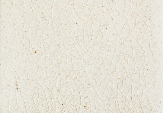
As I was waiting for my connecting train, I walked back and forth on the nearly deserted platform and I suddenly noticed the white tiles covering the walls and discovered very bizarre fine cracks in them. Many of these cracks were vertical and looked to me like the ruins of great vanished cities [...]. But the horizontal lines made me think of hallucinatory landscapes [...].
Jean-Louis Ferrier, Gespräche mit Victor Vasarely. Spiegelschrift 8, Köln 1971, p. 41.
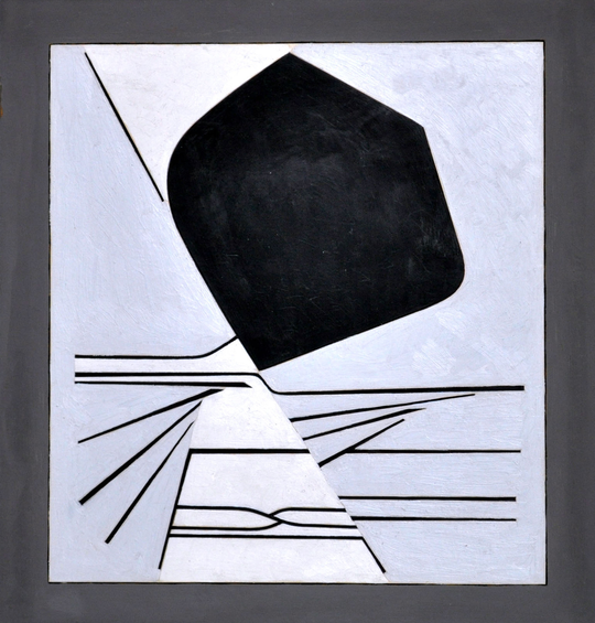
Oil on wood, 49 × 44 cm, Lahumière Collection, Galerie Lahumière, © 2018 VG Bild-Kunst, Bonn
Craquelé on a tile© Shutterstock
About one decade later, the memories of the tiles in the Metro station provided a new impulse for Vasarely’s art. He translated the cracked lines into abstract drawings. The drawings led in turn to large paintings with different-coloured zones.
The zones seem to be staggered one behind the other, as if there were a foreground and a background. The darker hue evidently forms the background. Or does it penetrate the pictorial field from above as a form in its own right? Vasarely led the gaze astray. He played with the laws of vision and perception as formulated in gestalt theory.
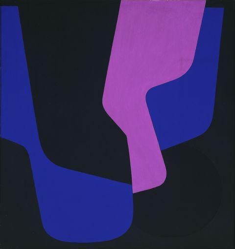
Oil on canvas, 108 × 100 cm, mumok - Museum Moderner Kunst Stiftung Ludwig Wien. Acquired in 1961 © 2018 VG Bild-Kunst, Bonn
Houses and forms
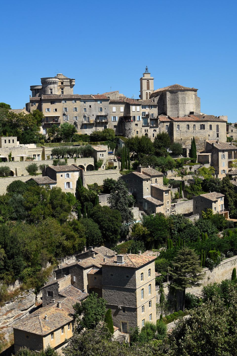
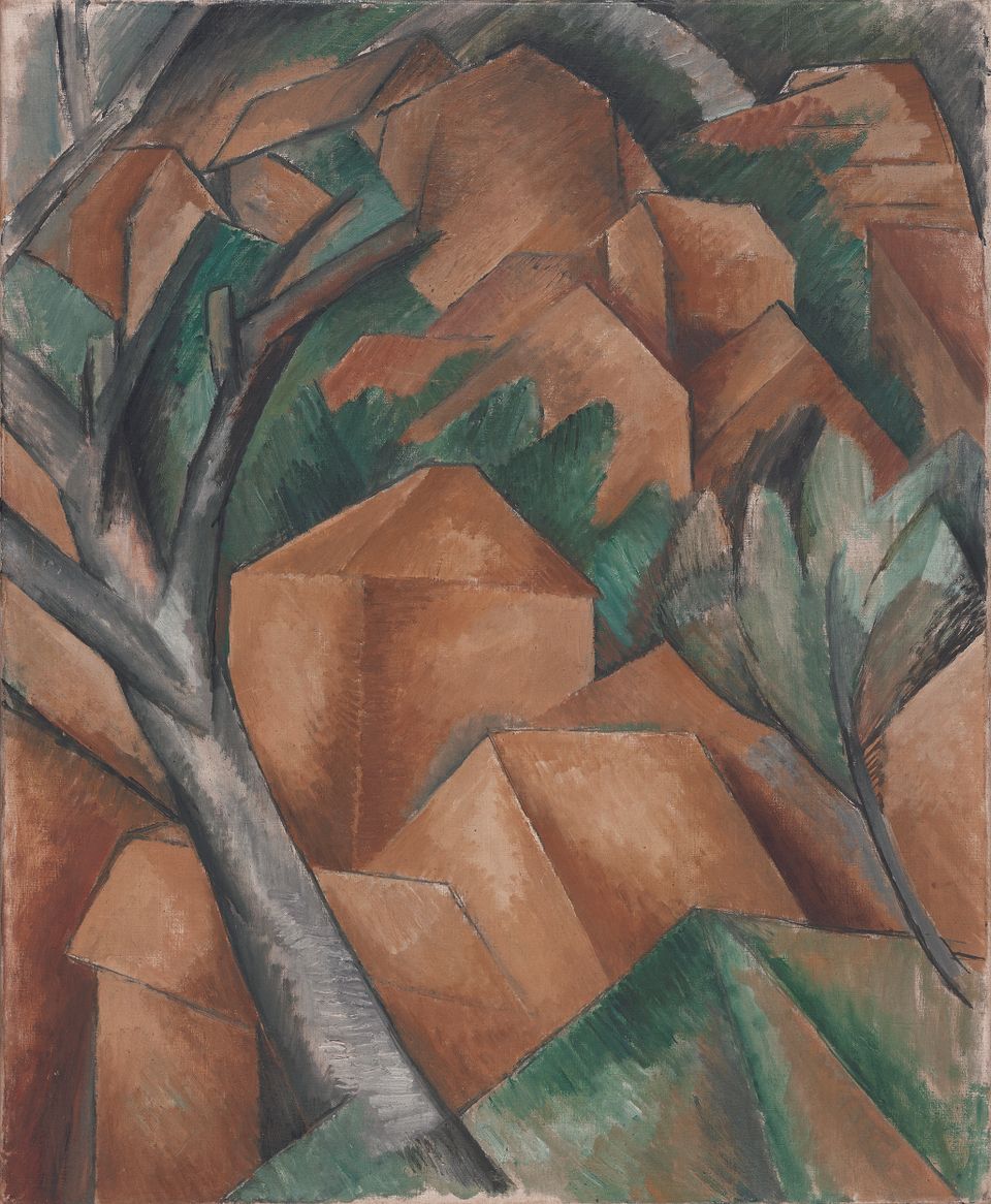
Do the forms lie on the two-dimensional surface or hover in three-dimensional space? The flickering sunlight in the mountain town of Gordes caused Victor Vasarely to doubt his own sense of sight.
Summer of 1948: Victor Vasarely moves into his temporary quarters in Gordes. The medieval houses and towers cover the slopes one next to and one above the other. In the glistening light, the artist witnesses an extraordinary effect. The cubic forms of the buildings and roofs appear as nothing more than bright and dark surfaces. They lose their three-dimensionality.
For Vasarely the houses were a means to an end. He translated his own visual experience into shapes and colours. They seem to be suspended in space and take on now two-dimensional, now three-dimensional form. Here they lie one in front of the other; there they appear side by side.
“On this surface, a spatial phenomenon emerges and vanishes again: the surface is in constant motion. [...] The tragedy and triumph of the painter has always been to realize the impossible, to give more with less, to give more on this one surface than just this one surface.”
Vasarely, Einführende Worte von Marcel Joray Entwurf und Layout von Victor Vasarely, Éditions du Griffon Neuchatel, 1965, Vol. 1, p. 32.
Radical
reduction
Form and contrast – Kazimir Malevich’s “Black Square” is the icon of early modern abstract art. It pointed Victor Vasarely in a new direction.
The Russian artist Kazimir Malevich broke with the painting tradition as far back as 1915. He painted a black square on a white ground. For the first time, the absolute absence of any object had become a theme of art.
Some forty years later, Vasarely picked up on the principle of the black square and developed it further in a painting. Each side of “Hommage à Malevich” features a black square and an elongated rhombus. We notice the irregularities only on closer inspection: the forms do not fit into each other exactly.
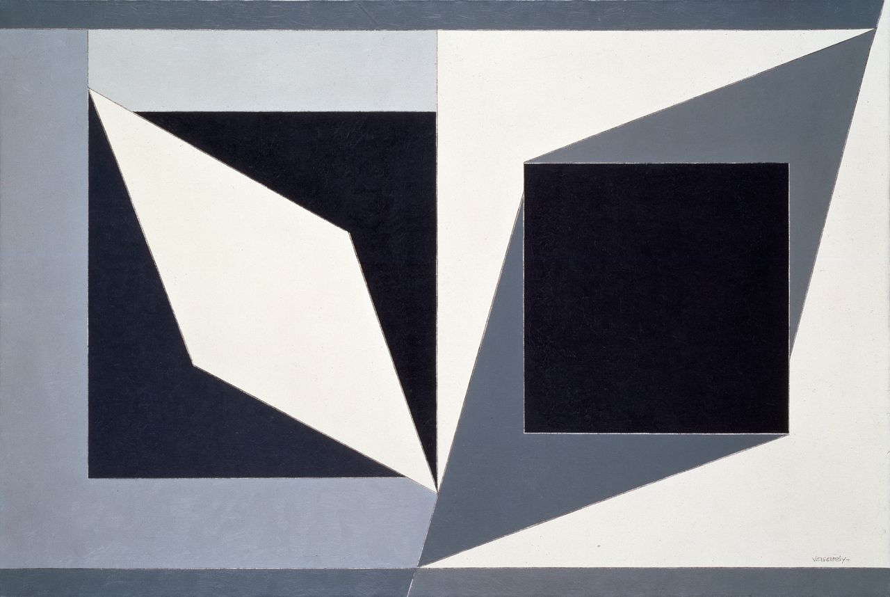
Acrylic on canvas, 130 × 195 cm, Private collection, Belgium © 2018 VG Bild-Kunst, Bonn
Vasarely now made visual experience the chief focus of his works. This pursuit required no colour: strong contrasts suffice to create an optical illusion. For several years, he accordingly limited his palette solely to black, grey and white. He also used the square again and again as a functional element in play with visual perception.

Oil on canvas, 195.1 × 130.1 cm, Kunstmuseum Basel. Gift from Carl Laszlo, Basel, 1964, Kunstmuseum Basel, Photo: Martin P. Bühler, © 2018 VG Bild-Kunst, Bonn
Oil on canvas, 100 × 79 cm, Städel Museum, Frankfurt am Main, Städel Museum – Artothek, © 2018 VG Bild-Kunst, Bonn
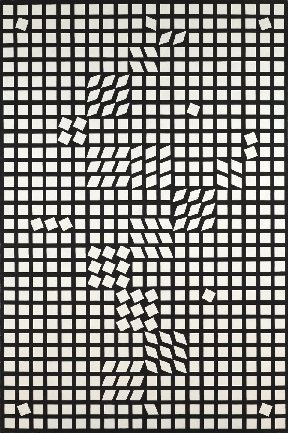
Tipped, rotated around their own axes, stretched into rhombi: the squares in "Tlinko II" break out of the rigid grid pattern. A subconscious endeavour to sort the system’s individual elements begins. The inconsistencies take our gaze on a dynamic tour of the picture surface.
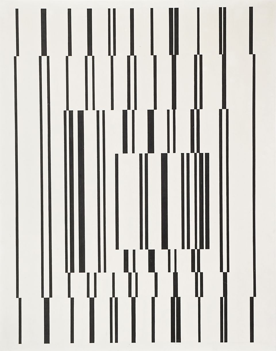
The viewer will wait in vain for the black lines in “Fugue” to lock into a neat row of congruent verticals. The rhythmically placed lines of varying width flicker before the white background. At the same time, the eye completes the contours suggested by the interrupted lines. An image of nested squares appears.
Motion begins!
As the viewer moves, the motifs change! With optical illusions, Vasarely pronounced human visual perception his field of artistic experimentation.
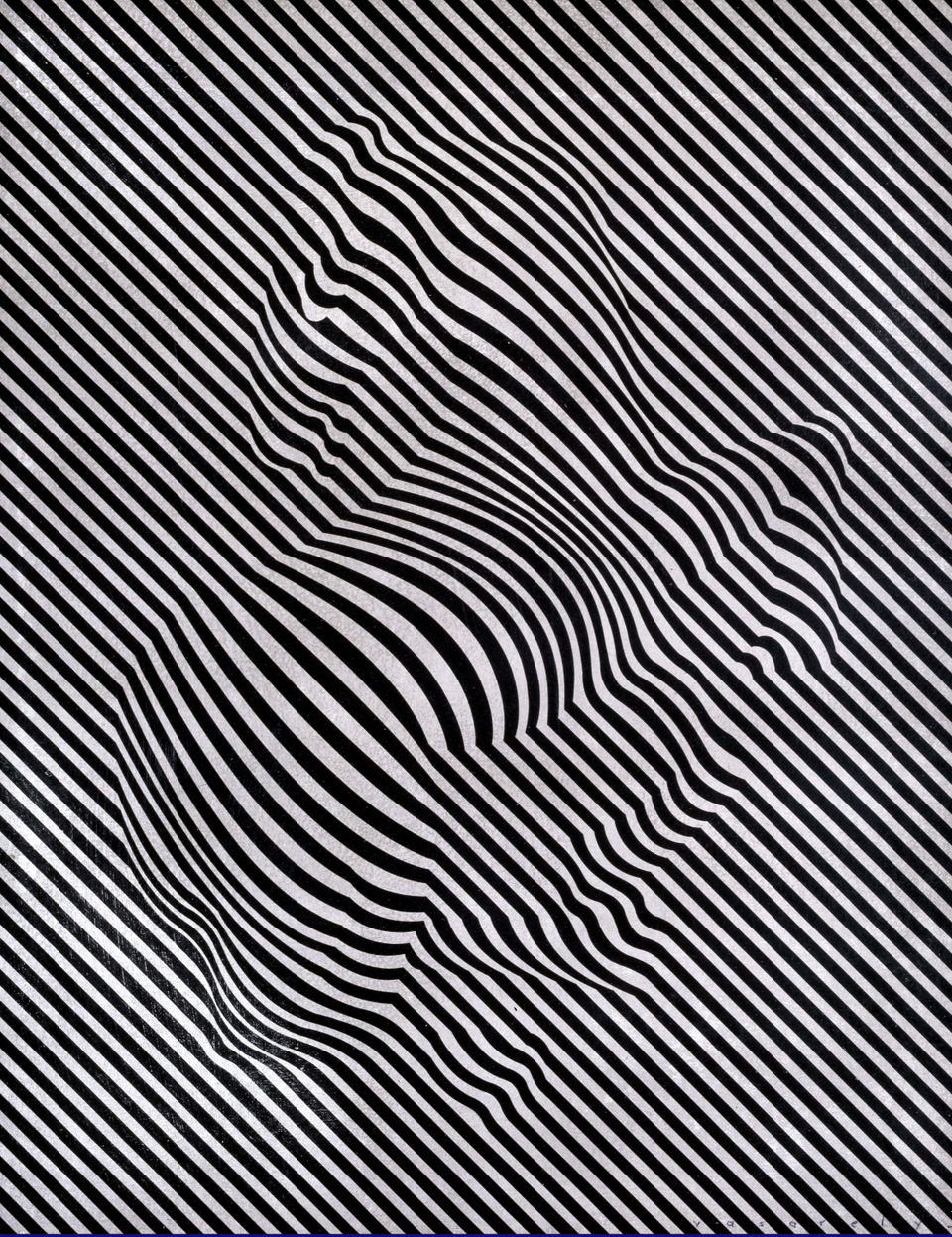
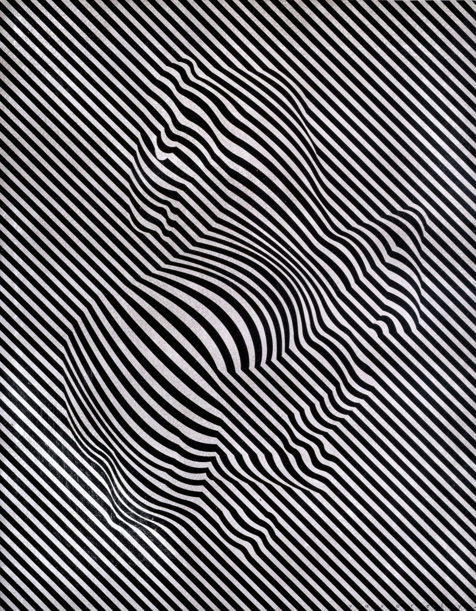
Flickering lines everywhere! Does the eye follow the horizontal lines or remain fixed on the figure? Taking collages of differently lined photo paper as his point of departure, Vasarely embarked on investigations based on the positive-negative principle of photography.
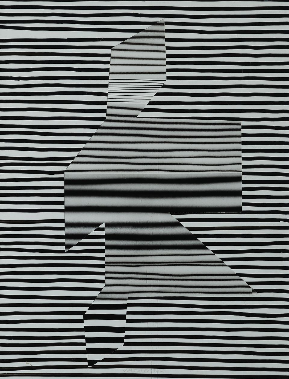
Collage, ink on paper and photograph, 63 × 48 cm, Janus Pannonius Museum, Pécs, Janus Pannonius Museum, Pécs, Foto: István Füzi, © 2018 VG Bild-Kunst, Bonn
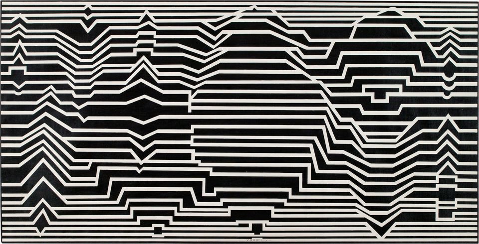
Oil on canvas, 100 × 193 cm, Collection RE Wiesbaden © 2018 VG Bild-Kunst, Bonn
He placed a positive and a negative film of a photographed drawing one on top of the other. Initially the surface appeared uniformly black. A slight shift of the overlying film caused the lines to take on a vibrating shape. He then transferred these structures to canvas, as in the case of “Meandres”.
Lines in motion. Vasarely copied his black line drawings onto transparent sheets of Plexiglas and set them up one behind the other with a space in between. As the viewer moves past these so-called kinetic depth paintings, the structures change.
“In my kinetic depth paintings, the moving viewer plays the most important role. When he views them from a fixed standpoint, he sees only two forms overlapping one another, owing to the transparency of the surfaces. But as soon as he starts moving, as soon as he steps forward or back or passes by the picture from one side to the other, it keeps changing; the emotional shocks follow one after the other unceasingly, and the work comes to life and becomes visually diversified.”
Jean-Louis Ferrier, Gespräche mit Victor Vasarely. Spiegelschrift 8, Köln 1971, p. 76.
Real movement or optical illusion? Alexander Calder made mobiles that change when they are exposed to a draught of air. Jean Tinguely created sculptures activated by mechanisms. Vasarely, for his part, worked with movements perceivable only with the eye and brought about solely by various visual stimuli. He published his ideas about kinetic art (from the Greek kinesis: “movement”) in 1955 in his Yellow Manifesto.
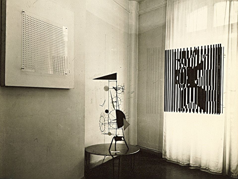
All Rights Reserved
The birth of
Op Art
Like the starry sky of night-time, Vasarely’s art also began to flicker before the eye of the beholder. It was the birth of Op Art.
In a workshop book, Vasarely collected small sketches of all his works. Again and again, a look through the book provided the impulse for a suspenseful new development in his art. For example, he introduced visual three-dimensionality to the two-dimensional black-and-white chequerboard pattern he had recorded in 1935. To this end, he enlarged some of the squares and diminished others.
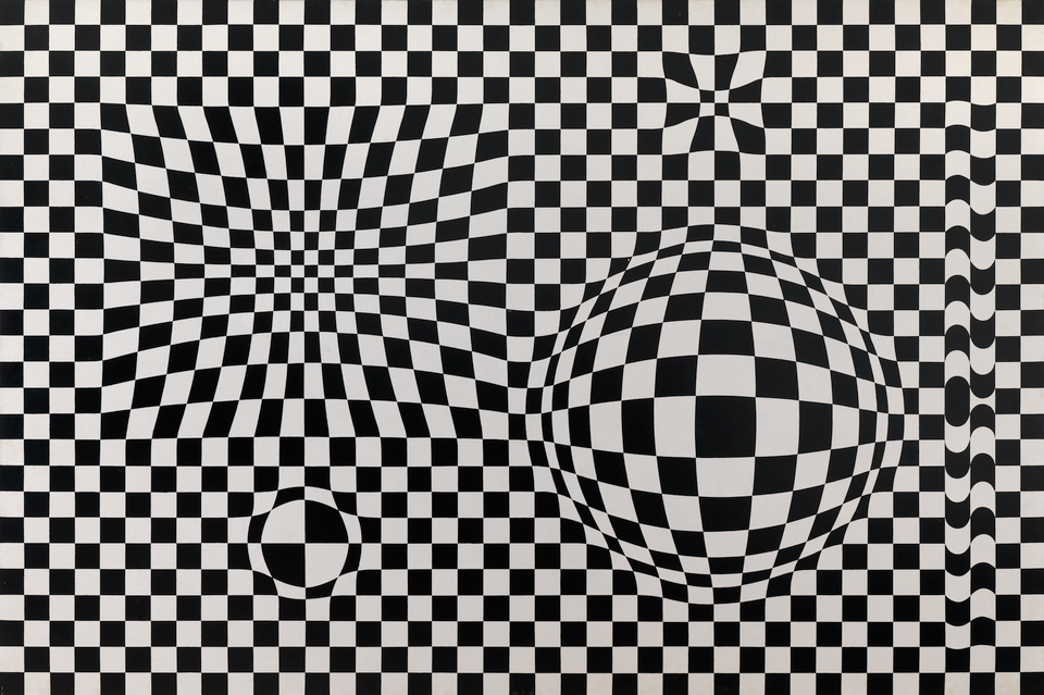
Oil on canvas, 130 × 195 cm, Private collection, Centre Pompidou / Philippe Migeat, © 2018 VG Bild-Kunst, Bonn
If the forms of regular structures are changed, they take on the appearance of spatial volume. It is no longer possible to perceive them as flat. Vasarely took this idea to the absolute limit of visual comfort.
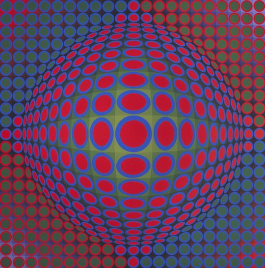

Acryl auf Leinwand, 200 × 200 cm, Michele Vasarely Foundation, ADAGP / Vasarely Estate, Photo: Michele Vasarely Foundation, © 2018 VG Bild-Kunst, Bonn
Victor Vasarely, Vega Pal, 1969Acrylic on canvas, 200 × 200 cm, Michele Vasarely Foundation, ADGAP / Vasarely Estate, Photo: Michele Vasarely Foundation, © 2018 VG Bild-Kunst, Bonn
In his Vega series of the early 1960s, Vasarely returned to colour, thus heralding the beginning of Op Art. He again played with various sizes, degrees of brightness and colour values to heighten the effect of spatiality.In his Vega series of the early 1960s, Vasarely returned to colour, thus heralding the beginning of Op Art. He again played with various sizes, degrees of brightness and colour values to heighten the effect of spatiality.
Pulsation, vibration: the images Vasarely recorded on canvas with a brush in the 1960s are strongly reminiscent of the computer-generated aesthetic of the present. Commercial artists and game designers still use visual effects of this kind today. Moving structures and patterns are often created through digital animation.
Vasarely thought about the possibility of programming his works on the computer, but deliberately decided in favour of painting. He made computer art without using a computer.
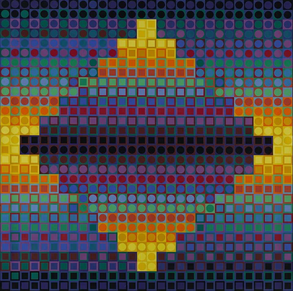
Art
for all!
Vasarely thought every member of society should profit from an artistically designed environment. He therefore worked on a system that anyone would be able to apply.
Vasarely developed the ideas of Bauhaus and De Stijl further. He created a simple system that, because it is universally applicable and comprehensible, enables the comprehensive propagation of his aesthetic to all areas of life.
“We can’t leave the enjoyment of art to a privileged elite of connoisseurs for all eternity.”
Notes pour un manifeste, in: Vasarely, Einführende Worte von Marcel Joray, Entwurf und Layout von Victor Vasarely, Éditions du Griffon Neuchatel, 1965, Vol. 1, p. 64/65.
It would prove to be Vasarely’s most important artistic invention: his “Plastic Alphabet” was to be a means of responding to society’s needs. Once again, the square serves as the basic element. In each case it is combined with another basic geometric form: a circle, ellipse, rectangle, rhombus or triangle. With the aid of six predetermined basic colours, the elements are then combined in various richly contrasting nuances. He called this basic module the “plastic unit”.
Like the letters of the alphabet, the “plastic units” open up virtually infinite combinatory possibilities for the creation of artworks. Vasarely patented his idea in 1959.
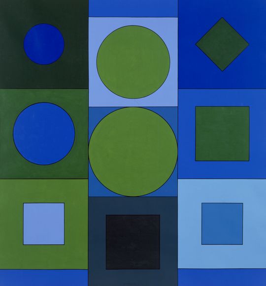
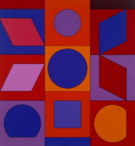
Acrylic on canvas, Each 160 × 150 cm, Private collection, Belgium. Foto: Vasarely Estate, © 2018 VG Bild-Kunst, Bonn
Victor Vasarely, Alphabet V.B. / Alphabet L.R., 1960Acrylic on canvas, Each 160 × 150 cm, Private collection, Belgium. Foto: Vasarely Estate, © 2018 VG Bild-Kunst, Bonn
Vasarely’s keen interest in science played a decisive role in his artistic work. Scientists and researchers frequented his studio. Inspired by their ideas, he often compared his "Plastic Alphabet" to an atom: elementary particles are the key building blocks of atoms; in like manner, the Plastic Alphabet was the construction kit for Vasarely’s art.
“Make your own Vasarely!”
The instructions for Vasarely’s “Plastic Alphabet” are like a musical score specifying the individual notes to be played in a piece of music.
The artist meanwhile employed several assistants in his studio. Among other things, they executed the numerous “Plastic Alphabet” paintings Vasarely had designed with the aid of a numerical system. As the artist no longer had to execute the works himself, they could be efficiently reproduced – it was the inception of the so-called “multiple”.
At the same time, Concept Art was on the rise in Europe and America. This current distinguished clearly between the idea of a work and its execution. Now the artist supplied the instructions, but often did not concretely specify the work’s actual realization. It could be carried out by a random person. Vasarely made use of this approach in his “Plastic Alphabet”: in 1969 he put a saleable building set on the market, accompanied by the motto: “Make your own Vasarely!”
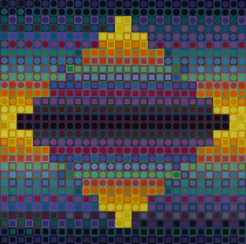
Plastic on wood, 153 × 153 cm, Musée d’Art Contemporain, Marseille bpk / RMN – Grand Palais, Photo: Benjamin Soligny / Raphaël Chipault, © 2018 VG Bild-Kunst, Bonn
This is not a painting! The individual elements consist of plastic. “Lacoste-W” was a further development on the basis of the “Plastic Alphabet”. It demonstrates one of the many possible variations offered by the simple system. It was in 1963 that Vasarely first presented the “Plastic Alphabet” to the public under the title “Folklore Planetaire”.
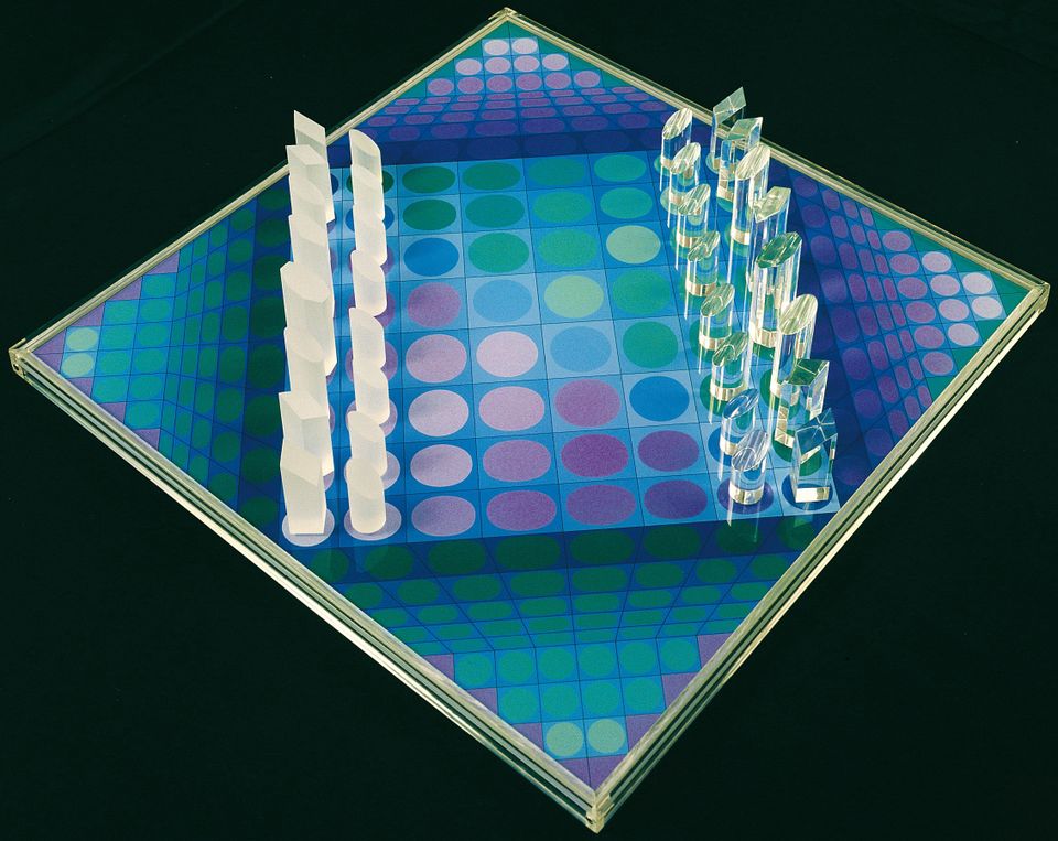
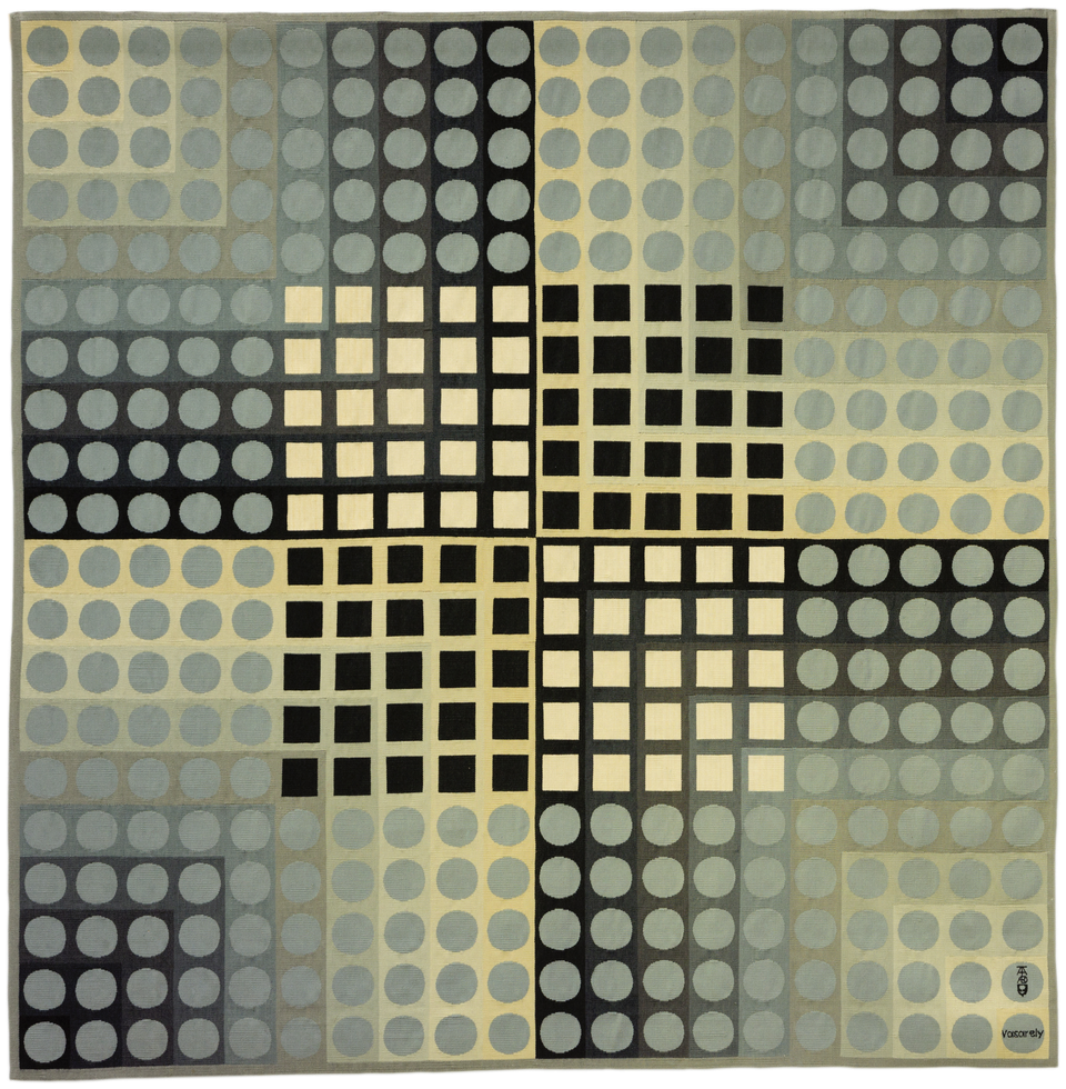
At the Parisian Musée des Arts Décoratifs (museum of decorative arts), the multifarious possibilities offered by the system soon became clear to the visitor: in addition to paintings and prints, Vasarely had also designed wallpaper, fabric, furniture and more.
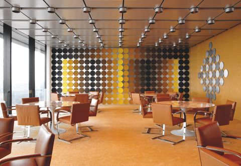
Spatial installation, Deutsche Bundesbank, Frankfurt am Main. Photo: Wolfgang Günzel, © 2018 VG Bild-Kunst, Bonn
In 1972, Victor Vasarely was at the height of his success. His art was on display everywhere and he worked for major companies. In the dining room of the Deutsche Bundesbank in Frankfurt, he and his son Yvaral realized a synthesis of the arts. The colour concept, based on yellow, gold, grey and silver, permeated the entire space. Round silver discs unite to form a kinetic wall that begins to vibrate before the eye of the beholder as he walks through the room. Reflections, the incidence of the light and the interplay between the various materials all contribute to the overall effect.
“The outrageously unjust oblivion into which he plunged is proof of the fact that it is nearly impossible to keep the esteem of elitist experts once you become popular.”
Francois Morellet interviewed by Catherine Francblin in: „Art cinétique: la sortie du purgatoire”, in: Art Press 314, July-August 2005, p. 28.
Victor Vasarely’s artistic oeuvre spans more than six decades. Born in 1906, he experienced, shaped and processed widely differing styles and influences of interbellum and post-war modernism. Today he merits rediscovery as one of the key artist figures of the twentieth century, whose pictorial language is still in use in many areas today.
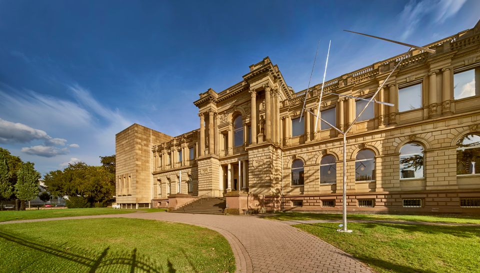
Thanks to the rapid spread of his multiples, Vasarely was omnipresent. Yet his popularity also made them available to the point of tedium. The more successful the artist, the more commonplace his art – which, tragically, led to the loss of its uniqueness. By the time he died in 1997, both his own popularity and that of Op Art had become obsolete. The comprehensive retrospective at the Städel Museum foregrounds Vasarely’s painting oeuvre. In the process, we encounter not only a completely different and more complex artist, but also gain a new perspective on twentieth-century modernism.
2D becomes 3D, paintings become sculptures, squares become cubes.
Vasarely’s paintings play with the perception of three-dimensionality. The experience of Op Art expands into space. His sculptures can be viewed from many perspectives. As the viewer walks around them, they make a new impression on him at every step. Now’s your chance to discover the optical effects and plays of light in the exhibition – and allow yourself to be led astray!
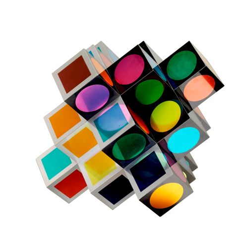
Screenprint on aluminium, 50 × 50 × 50 cm, Vasarely Múzeum, Budapest, Szépmüvészeti Museum – Museum of Fine Arts Budapest, 2018, © 2018 VG Bild-Kunst, Bonn


